Post-Production and Designing : Feature Article(s)
- Haniya Fareed
- Apr 14, 2023
- 2 min read
The First feature article I designed was a double-spread feauture article - the picture or this article was spread on the page next to it, leaving about a quarter of a space for the text ( Title/Heading and body ).

The Heading / title was given a bigger size for obvious reasons and I colored it grey / steal grey which gave it a different look than the rest of the body text.
So because I was left with like a quarter of a page so I wanted to fit a good amount of body text on it without making it look clustered, so after writing 3 paragraphs I decided to add a white column aligned next to it to make the text look less clustere and to add a kind of fun element to the page.
I then proceeded to write the rest of the text in that columnwith black colour and kept it's font size small so I can get as much txt added to it as possible without making it too small.

And this is what the end result was!

Now let's talk about how I made my other feature article.
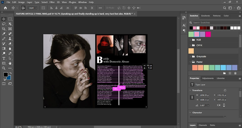
For this, I have written a feautre article on a page right next to conceptual portrait photograph I took for domestic abuse.
The first thing you see on the page are three small photographs of my model. I added these photographs because in my opinion it added more charachter to the article and also sort of supported what I was trying to raise awareness about.

Then I got started with the text. For the heading I kept the 'B' for battle some size bigger than the rest of the text to give it some character and to try something different. The font I used for it was Brittanic Bold. I used this font for all the text in this article.
Now, for the body text, again I wanted to fit as much text as I can without making the article look 'too text heavy'. So I first wrote two paragraphs below the heading, towards the right side and then drew a white line and wrote two more paragraphs which a liitle more text heavy than the other ones on the left side. I aligned the first sentences of both the top paragraphs to make sure they were rightly aligned.

And here's what the final product looked like!

For both the article, I stated / added their page numbers in the bottom corners, bottom left corner for pages on the left (pages 2 and 4) and bottom right corner for the pages on right (pages 3 and 5). I kept their font sizes small but not too small so they get noticed by the readers. The font I used for them is Bell MT.
Here are the photoshop files -


Comments