Post-Production and Designing : The Cover Page.
- Haniya Fareed
- Apr 2, 2023
- 2 min read

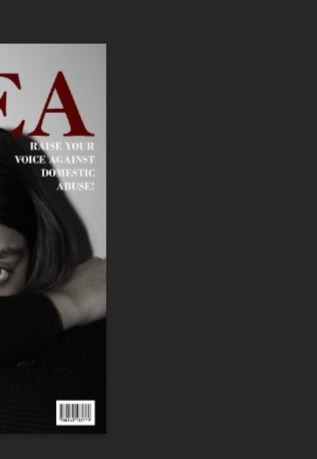
I looked at quite a few magazine covers and photography inspirations so I did have a vision in my mind about how I wanted my cover to look like.
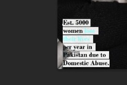
I wanted a close-up face picture of my subject in black and white so I could write the MastHead in red / maroon colour, making the MastHead stand out ans so that's what I did. I wanted to show a close-up of the subject's face to show and make her emotions more prominent especially her eyes and her bruise and her black/dark undereye. I also purposely made the words 'lose their lives' in a red/maroon color to associate it with blood and to make it stand out a bit more than the rest of the text in the cover line.

So because the name I decided consisted of just 4 letters, it was pretty small and didn't cover much space so to compensate I had to increase the size of the text - the size being 210pt and I used the font Bell MT which was available on photoshop. And I changed it's colour from white to red/maroon purposely to make it stand out and be more impactful and eye-catching.

The font I used for both the cover lines is Bodoni MT. I kept the color of both the cover lines white except the phrase 'lose their lives' which is red/maroon to indicate death and blood of the women who died battling with domestic abuse. The rest of the lines are white so they're easily visible and readable from a far as well as up-close.

Here's the photoshop file for the cover -
Note : All the fonts I used are already available at Photoshop, so I didn't download or use any other fonts.
The fonts used were -
Bodoni MT
Bell MT
Arial (bold)


Comments