Research and analysis on some different types of magazines content page design
- Haniya Fareed
- Oct 9, 2022
- 1 min read
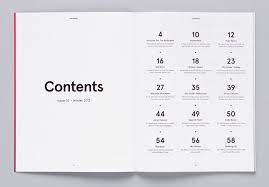
Usually the first page you see when you open a magazine is the table of contents page- it gives the reader an overall idea of what they'll find inside the magazine and what pages they'll find it on.
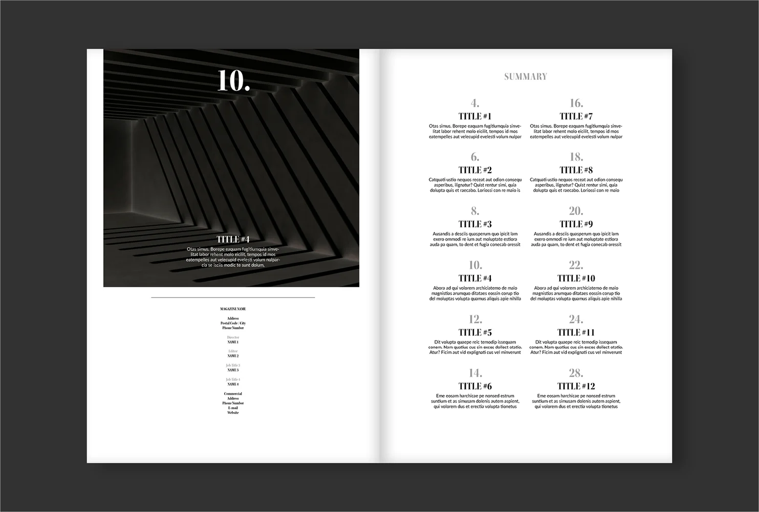
Some of the content pages are spread put and covering two pages, this type of design gives the editor more room to work with and also gives them more creative space.
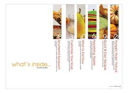
This way the editor can incorprate little pictures with text and numbers as well.
There are also content pages that aren't anything too fancy or out of the box and creative, they are simple and minimalistic because honestly sometimes less is more. These simple designs can be spread out on two pages or just be on one page.
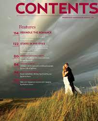
And to make the content page even more attractive and creative, there are also content pages that show off photography as well- this can be fashion photography, lifestyle photography and literally any type of photography that attracts more readers.
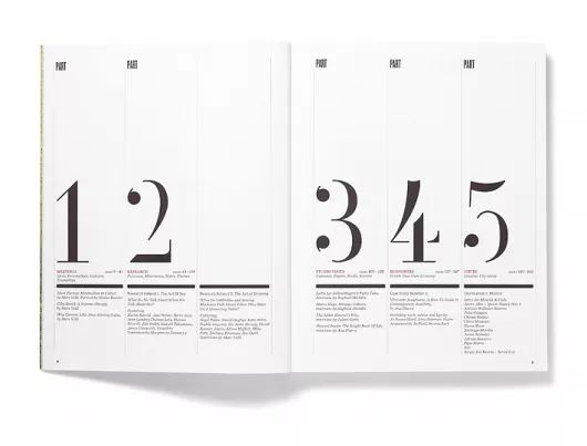
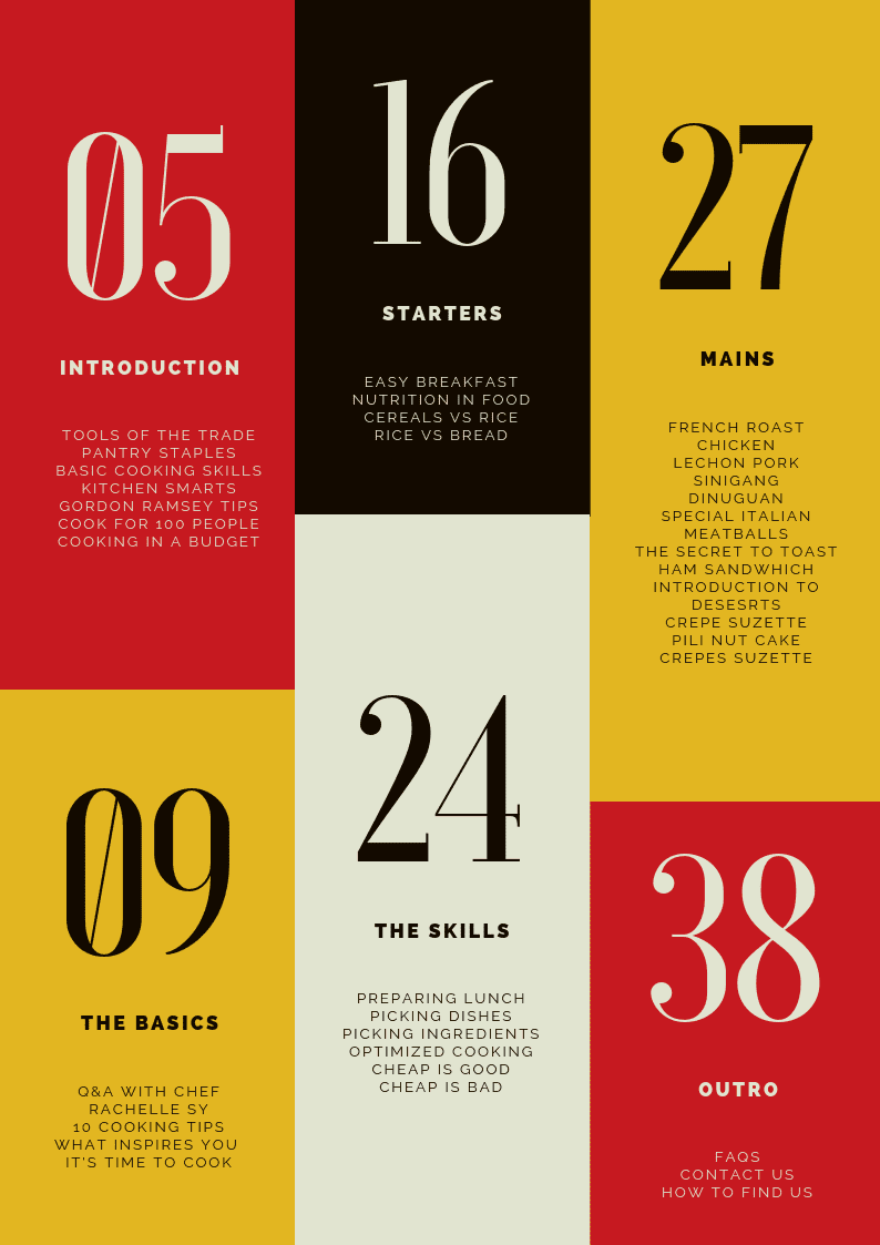
And lastly you can also use columns and make creative content page designs. Using and playing with shapes is always fun and in this case it also ends up in making the magazine look more fun and attractive especially if it's done with fun and different colours that compliment one another.




Comments